techniques used :
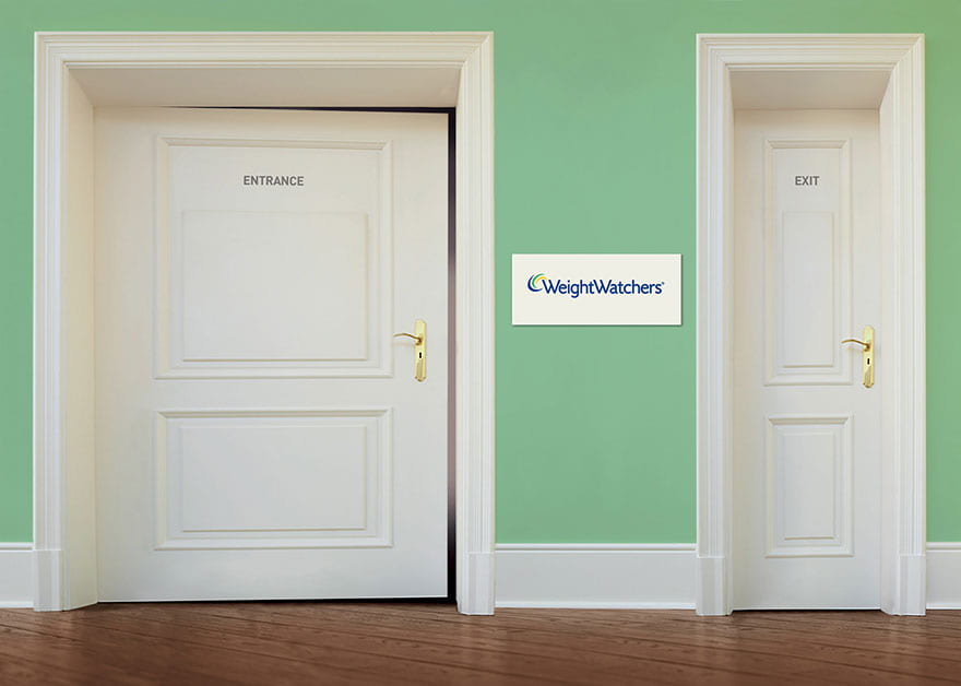
Frames : The entrance door is slightly opened, indicating that everyone is allowed to enter the world of “weightwatchers”. The background behind the entrance door shows the mysterious nature of what is behind the door, and the brightness behind it implies the benefits of entering through that door. The line that separates the floor (foreground) and the space behind the door emphasizes the difference between two different worlds.
Power dynamics : The entrance door is much bigger than the exit door, potentially showing that people who enter the room, a.k.a the customers, are the ones with power, not the company.
Eye-level angle : To put the viewers on an equal footing with the character in the advert, allowing the viewers to identify with the character. Once again, this is used to highlight that “weightwatchers” is available to anyone viewing the advert.
Rule of thirds : when the image is divided into 9 grids, it places the company’s logo in the middle in order to allow the viewers to easily spot the name and hence contact the company if interested.
Color of the background : light green goes well with the white color of the doors, and both colors create a calm atmosphere so that the advert itself does not seem too violent or dull.