07/11/19 -07 Printed Advertisement Analysis Redone Using Composition Techniques
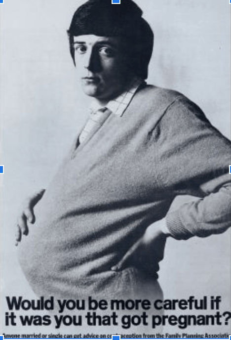
This ad, first released around the 1970s when contraception as a form of protection wasn’t a very big part of education systems and women weren’t made very aware of it, leading to large families and many cases of teen pregnancy. This image is of a pregnant man, captioned with bold and large typography as a rhetorical question to men asking them if they would be more careful about their sexual activities if they were the ones that were going to be affected. The use of large, dark text brings more attention to it and the use of a rhetorical question makes the ad more interactive, causing the readers’ to think more rather than simply reading it which results in it being more educational than it being moralistic and patronizing. The words at the bottom is displayed in a smaller text as a form of information to be able to gain excess knowledge about contraception at the Family Planning Association.
The individual in the frame is kept isolated from the freedom outside the frame and he feels rather trapped and suffocated in his current situation reading from his emotions. The pregnancy of the man is made mise-en-scene as that is the conflict he faces and the challenges he is forced to overcome. It is one of the subjects of the frame that the viewers eyes are drawn towards. The positioning of his hand on his stomach further brings more attention to it, it remains as a symbol of what the character is battling with. The individual being the only object in the frame of a large size where not much negative space is present, dominates the frame himself as he has primal control. The negative space in the background shows the loneliness in the journey perhaps and the lack of encouragement or happiness he feels as he is the only one to look after himself and his soon to come baby. The close-up of the man directly in line of the observer’s eye shows very little background and instead focuses on his facial expression of helplessness. It’s not too close that the pregnancy is not visible but isn’t too much of a long shot that the emotion isn’t evident. The eye level angle of the advertisement puts the audience on an equal footing with the individual. It helps them identify with the individual and feel and connect with them more as they see the emotion and look in his eyes. This further helps them empathize with him and his situation.
The use of visual and lexical elements together depicts a very important message and the use of either on their own would be rather complicated and confusing for the receiver. Seeing only a pregnant man in an ad could create a lot of misunderstandings and people may not stop to look at the ad if it contained only the lexical elements in it. Hence showing that the interplay of visual and lexical elements can both purposefully and unintentionally position the reader’s reception of a text.