by curri58987@gapps.uwcsea.edu.sg | Jun 8, 2020 | Grade 10, IGCSE Archive, Me
The first thought I had when writing this, was how on earth am I ever going to top last year’s personal statement?
For a few years now, I’ve been trying to come up with new and original concepts for doing my personal statement. In Grade 8, for example, I wrote a dystopian fictional short story looking back on all the events of the year (with the nostalgia that a 13-year-old should definitely not have any clue about). In Grade 9, I likened the many books I’d read over the years to events in my life, making awful attempts at dry humour (which was almost definitely me trying to cover up all of my gaping insecurities). It was probably one of the most ‘me’ things I’ve ever written.
And this year, the pressure was on to find something new and different to do. But to be honest, if last year’s personal statement was the truest to me my writing’s ever been, then why would I have to change that?
Why on earth do I feel this overwhelming pressure to try and top myself?
To be honest, I don’t think that any of the other ideas that I came up with would be as fitting as last year’s concept. And there’s something sweet about concept consistency, it allows the idea to mature and evolve over time, organically, just like the storyline and rising tension of Kokoro, by Natsume Soseki. It feels like you’re waiting, constantly, for something to happen, not realising that there’s something growing, and growing, and growing – and I feel that’s perfectly fitting when describing my year.
I’ve actually had one aspiration for over a year now! (I know, I can’t really believe it myself.) My aspirations have been growing (I really hope they continue to do so, while I sit there blissfully unaware). I still want to teach, preferably in university, and I want to be in the humanities field. As Grade-9 me so eloquently put it, ‘After all, with the amount of time I spend on ‘intellectual’ pursuits, being in a learning institution is a place I think I’ll be quite happy for a long period of time.”
And speaking of intellectual pursuits…
This year, I am very proud to announce that I was shortlisted for the 2020 Immerse Essay Competition (in Philosophy), therefore winning a partial scholarship to Cambridge University Summer School. Although the pandemic threw a spanner in the works (meaning I’m going to be attending the course next year), winning a scholarship gave me the self-esteem boost that I’ve needed for years. (Here’s the essay if you’d like to read it.)
Even though I know that I’ll be wrestling with my self-esteem for a very long time, hopefully I’ll emerge victorious from the seas like the Old Man from Hemingway’s famous novel (that I finally read). Future me, please look upon past me with kindness, and empathy, because past me looks at you with all the love and hope she possesses.
This year, I’ve also managed to win my National Youth Achievement Award (in Silver) as well as become Co-Chair of Ladakh GC, the current oldest GC at the school. However, I feel that these achievements are only meaningful because of the experiences they brought. Doing the Achievement Awards exposed me to the convalescents at Hougang Care Centre in Singapore, and in particular, the most sincere ‘Thank you’ I’ve ever experienced.
This ‘thank you’ was spoken to me only in my first few weeks of doing the service, and it was said while looking directly into my eyes. They took my hand, and spoke quietly, hushed, with such deep gratitude that I could even see it in the blackness of their pupils. I was speechless for a few moments. I had been so wrapped up in making sure that the activity was done well, and that they were engaged, barely acknowledging my own work and constantly doubting myself – but all that crumbled in a single moment at the sound of two words – ‘thank you’. I don’t even know if I can describe how much that moved me. They went out of their way to shake my hand and thank me, because I created a change. A change in the monotony, a change in what is ‘normal’. I tampered with Arundhati Roy’s Love Laws, just for a moment, and they thanked me for it.
And it is experiences like these that truly made my year. I was in Write for Rights again this year, and managed to fulfill my goal of 80 letters in 24 hours (I in fact wrote 85). This week of tiredness and a sore wrist gave someone, somewhere, a chance at a home, and it was so worth it. We even received a reply this year (even though it was slightly condescending), and that truly filled me with a sense of achievement.
This year, I’ve also gained a new interest, and a new area of expertise: Web Design! I’ve designed many websites now, and created countless resources for service groups at school to develop their portfolio websites. My own website (on which you’re probably reading this) is one of my crowning achievements, and is hand-made from scratch. I’ve also designed the HS Service Exec Site (the information database and all it’s pages specifically), as well as the Ladakh GC portfolio and the Fitness with Hougang Care Centre site.
And now, I finally move on to the most awaited part of my personal statement – and the ‘Most Impactful Book of the 2019-2020 School Year’ goes to…
(It’s absolutely no fun if you don’t drumroll)
‘Beloved’, by Toni Morrison.
Surprisingly, this wasn’t that difficult of a choice, despite all the other books I’ve read this year (runners up: Artist of the Floating World by Kazuo Ishiguro and All Quiet on the Western Front by Erich Maria Remarque). It’s extremely hard to summarise how ‘Beloved’ made me feel, but almost throughout the entire thing I felt like my heart was being ripped from it’s veins, shredding into strips of bloodied flesh, and then stitched back together and shoved right back into my hands below the gaping, black hole in my chest. Once you started reading, the words seemed to suck you in and rearrange themselves into what Morrison was truly trying to say, grammar rules be damned. The strange rhythm of the words is lilting, lyrically and empathetically capturing the most grotesque and cruel part of our nature yet still maintaining to present the beauty of the resilience of the human spirit, and the hope and endurance we hold despite the pain and abuse inflicted by years of history.
And someday, in the future, maybe when I’m a professor in a university somewhere, I hope to read Beloved again, and have my heart taken away from me again.
That’s all from me this year. Thank you for reading.
by curri58987@gapps.uwcsea.edu.sg | May 5, 2020 | elp, ELP Highlights, Exploring Art, Exploring Art Highlights, Grade 10, Grade 10 ELP, IGCSE Archive
Visual Language: Albums
I still recall the very first English lesson I had in my last year of middle school, where my teacher asked us a very curious question. Could a piece of music be a text?
The word ‘text’ is tricky. Even the word ‘art’; people enjoy assuming the word means ‘paintings and stuff’. But there is a strange sense of solidarity between writers, painters, composers, sculptors, poets and playwrights, that they are all creators in their own right. They are the creators of thoughts inside other people’s heads.
Is it right that we call this ‘art’? Or is ‘text’ a better word for it?
It doesn’t help that whenever we create presentations, the options are divided between ‘text box’ and ‘image’, even though an image might be considered a text in the first place.
By my 8th grade English teacher’s definition, a text is anything that can be interpreted.
We can interpret images, sure we can. Images can create thoughts in our head just as well as words can, perhaps even better, hence the saying ‘a picture is more than a thousand words’. We have videos to accompany our music, advertisements lining our streets, covers on the front of our books, cartoons for our children in our homes.
Visual language is a funny term. After all, language is auditory. It makes me picture that whenever someone talks, the words that they’re saying fly out of their mouth in 3D letters, dissipating into the air afterwards, as if we were walking subtitle generators. But we forget, does language have to be in words? Does art have to be in words?
How did we form such a bias towards writing?
So in the spirit of teenage angst, I’d like to look today at a few album covers. This is an excerpt from the full analysis. You probably won’t have seen these, since I’m bringing in K-pop – that’s right, Korean music album covers. (I’m a teenager, spare me.)
Gender, Power, and K-Pop Albums
There is ALWAYS a connection to gender. It doesn’t matter where you look, gender expectations are so ingrained into our society that we barely realise the connotations our words have. I find it quite surreal that some of us get twinges of discomfort whenever males are given the adjective ‘pretty’.
But still, here are some quite recent albums, one by a boy group, one by a girl group. It’s quite obvious which is which. I am not saying this because of the colour scheme. I think we’ve moved past that and there are enough K-pop girl group album covers with the colour blue in them.
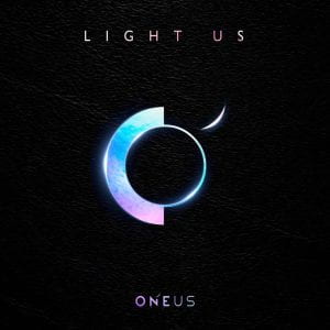
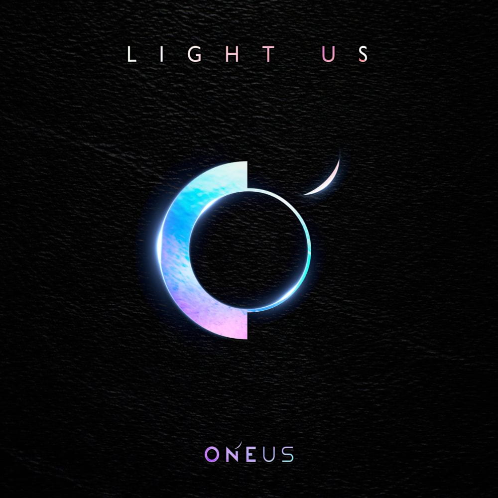
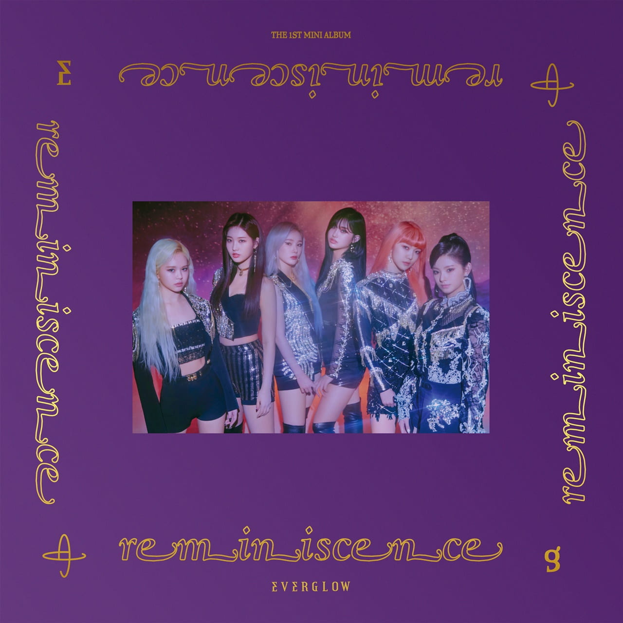
First of all, I’d like to point out the shiny gold lettering in a cursive script on Everglow’s cover (the girl group, for their 2020 album ‘Reminiscence’), whereas the sans serif all caps on Oneus (pronounced won-us, for their debut song ‘Valkyrie’ in 2019). I have noticed that a lot of girl groups and female artists enjoy using cursive or serif lettering (not ALL), and that male groups very much enjoy sans serif all caps. Is it a strength thing? Is it a power thing? I think it could be, since male K-pop groups tend to go for more powerful concepts, especially with songs. Fast-paced dance tracks are a common staple amongst boy groups, accompanied by some impressive choreography that is often a lot more physically strenuous than girl group choreographies. This is reflected naturally within the album cover.
Not to mention, a lot of the girl group albums that I was looking at feature explicitly the members of the group, whereas boy groups tend to use other visuals, logos and heavy branding. This is NOT true for all boy groups. Some boy groups that like to feature their faces (sometimes) include Seventeen, NCT and some GOT7 albums. Some girl groups that don’t always feature their member’s faces include Red Velvet, 3YE and some Apink albums. However, there is a general trend that girl group albums are more likely to feature the artists’ faces.
Interestingly, in the past, it was very common for K-pop artists to put their faces on the album cover. (I say artists, it’s really the company branding them, which is a whole new topic).
An exception to this trend is in solo artists. Regardless of the gender, male and female solo artists display their faces on the covers of their albums. Perhaps this is because of advertising, that it’s easier to edit their faces on there. However, a much more plausible reason is the phenomenon of ‘group culture’ in K-pop. Groups are much more popular than solo artists, and one of the first questions many K-pop fans ask each other is ‘who is your bias?’ which is essentially ‘name your favourite member’. There are even stereotypes within each group for fans who bias specific members. Fan culture is centric around groups, so solo artists have to stand out in their packaging and put their brand out there to build a stable fanbase.
‘Boy Group Culture’ is also an obvious phenomenon. Boy groups rise to higher levels of fame. Reasons for this may be because boy groups have ‘fangirls’, that is, the majority of their fanbase is women. The trope of a ‘fangirl’ is well known, even amongst Western artists. One girl group member even remarked that they thought solo release showcases on Korean TV (entertainment companies reserve entire broadcast sections for that group and their release) was only for ‘privileged boy groups’. All of this may mean that the girls feel they have to show their faces on the album covers to stand out.
This links perfectly into the ridiculous standards for women in K-pop. For women, their appearance has a huge weight on their marketability. Boy group idols have even remarked that they never faced the same pressure as girl group idols to lose weight and look good. An insane amount of money goes into styling for girl groups, so that they look perfect. The plastic surgery industry in Korea is massive. Therefore, girl groups broadcast their ‘perfect’ appearance on the album cover.
However, there is a new trend rising in K-pop – a concept we like to call ‘girl crush’, or the equivalent of ‘girl power’. These are more powerful concepts for girls, with hard-hitting baselines and more difficult choreography. It’s perpetuated by many well-known groups such as Blackpink, as well as a rising 4th generation of artists such as ITZY, Cignature and Weki Meki (all bringing a new, electronic sound with interesting harmonic clashes. Interestingly, these clashes are ‘unnatural’, but still sound good and make their way into popular music, which is an obvious statement of ‘I’m unique, and I know it’).


The first of the two albums I’ll examine here is one of my personal favourites, as the cover for CLC’s digital single ‘Me’ released in 2019. It uses clever multi-language wordplay, the English for ‘me’ and the Chinese for ‘mei’ (which means beautiful) which is the character that is sideways written in the red brushstrokes on the album. Korean lyrics in the chorus translate to ‘Beautiful me’. The song itself not only explicit in its lyrics, but also in its sound. It’s powerful, and the notes don’t always work together – but it’s still catchy, and musically complex.
The album cover, then, is bold, yet feminine. The strokes of the character, seemingly done in red marker, serve as almost a warning against those who question their ‘beauty’. The fact that it’s in multiple languages illustrates that they’re confident, that no matter where they go, they’re beautiful. It’s tilted horizontally on the side, I think, as a statement. They aren’t the norm, they aren’t ‘right side up’ but they’re still beautiful. The simple ‘Me’ in all caps is powerful yet simple, and the blank space beside it shows that they don’t need anything else but themselves.
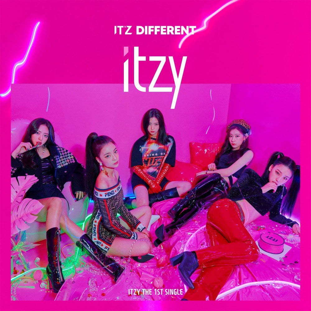
The second album cover is also from 2019, from a group called ITZY (pronounced it-zee), and the song ‘Dalla Dalla’ (meaning ‘different’ in Korean) is all about standing out and being proud of your uniqueness. The bright pink that clashes with the red clothing they’re wearing only serves to highlight their difference, but also their confidence. There’s pink lightning across the cover (girl power, very literally) and the slogan above their name for the title of the album even reads ‘IT’z DIFFERENT’ which combines their group name in a very natural association with their pride to be ‘different’.
I also find it quite interesting how they’re sitting on the floor. Usually, camera shorts would be looking UP at them to place the viewer ‘below’ them, creating an image of dominance and power. However, ITZY’s album is not like this. They’re rebelling against that, ‘different’ once again. It also seems as if the viewer is looking down upon them. This might refer to Korea’s extreme beauty standards, and their confidence is literally ‘blocking out the haters’. Sure, they’re sitting on the floor, but they look better than you ever will sitting on your floor.
I have much more to talk about, but I think I’ll save it for my IB Extended Essay. K-pop’s diaspora has grown, and with it, trends and ideas and ambitions too. I hope this was interesting for you. Stay safe, stay healthy. Thank you for reading!