Reflection

What went well:

  • Decent close analysis was able to convey the things I have planned to within the time 
  • Was able to link the works consistently with the issues

How prepared you felt:

  • I didn’t write an essay to remember off, I had prepared the structure and detailed ideas of what I am going to say in each section. I also feel like I have understood the works enough for me to be comfortable and flexible with the way I speak. I would say I generally felt prepared, but since I don’t really know word for word of what I am going to say, there was a bit of anxiety. 

How you responded to the questions:

  • The questions were definitely the most nerve-racking part as I don’t really have a clue of what is going to be asked. Particularly, in my case, my partner asked me about how the context of the literary work may change the way the works are interpreted. I think I was able to answer this question pretty well as I understood enough of the context to build my own interpretation. However, when he asked about how the issue may be prevalent to modern days, ideas were less intuitive as I dont really know too much about the political world, some basic understanding but nothing insightful. 

What improvements you need to make over the next 10-14 days

  • I definitely need to rehearse my notes so I can have a bit more confidence in myself in terms of presenting my ideas. I think I also need to bring in more technical terms and analyze micro details succinctly. 
  • I also want to prepare more for the questions and so I would ideally spend my time learning more about the BoW and the context. Also, within our modern society, perhaps look at some examples and have an understanding of its relation to the issue of state violence. 

What mark you would give it and why:

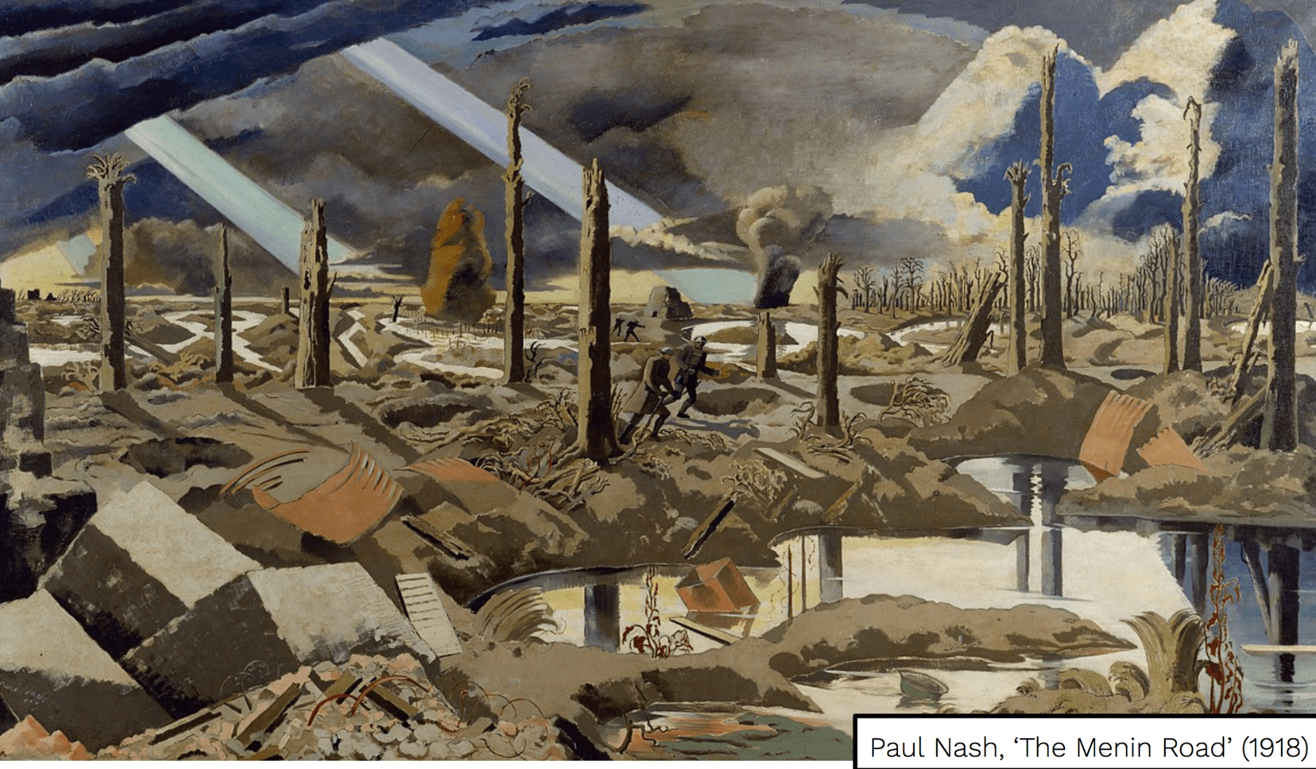
  • I would give myself around 28 because although I felt like I did present my ideas properly, upon listening back to it, I think I need a better structure. I need to make the ideas flow and build upon each other as it felt as though I was going back and forth at times with some of the ideas. Also, I think I have missed out on some of the simpler ideas in terms of the close analysis, like for Nash’s art, I completely forgot about the color schemes he uses in his BoW.

Gordon Park’s Essay Practice

Gordon Parks is a well-known influential African American artist back in the 20th century, being multi-talented in many different professions including a film director, musician, writer, and most notably, a photographer. He is best known for shedding light in the difficulties and pride of the African American experience through the glamors of photography. Park wanted to address through his work, the inherent disadvantage African American’s were placed in and ultimately make about change in the social injustice and racial prejudice African American’s faced in their lives. “Ondria Tanner and Her Grandmother Window-shopping” is one of Park’s works for life magazine that was never exhibited during the times of racial segregation. This piece of work illustrates the racial and class segregation in American society and subtly depicts the harsh realities of young African Americans who are internalizing the effects of systematic racism.

Through this artwork, Park uses the concept of “Real vs Apparent” and even classism to highlight the severe injustice experienced by African Americans. Firstly, one of the most noticeable elements of the image is the myriad of purely white mannequins. By having the mannequins – which are objects used to aesthetically display consumer goods – as only of white color, it depicts the dominant force of white culture and the preferred race in society. Hence, the superficial nature of the mannequins is ironically representative of the reality of society and reflects the natural racial prejudice against African Americans. Furthermore, the glass wall that separates the mannequins and the young African American girl represents both the figurative and literal barriers between races: the inability to become white and the racial segregation that prevents equality amongst races. This coupled with the relatively high-angle shot and the elevated foregrounded white mannequin, illustrates a power-dynamic, not only created by racial differences but also through socio-economical classes. The way in which the centered white child mannequin is towering above the African American girl also quite literally suggests the uneven grounds and the inherent disadvantage African Americans are placed in as soon as they are born. The composition of the photo is also rather interesting, with the light shining down in front of the centered mannequin, whilst the dark shadow on her back is seemingly aligned with the African American girl and her grandmother. This may bring metaphorical implications of how white Americans are shined with success in society, whilst black African Americans suffer in the background, hidden in the shadows. 

Despite this, the African American girl seems interested, or perhaps even inspired, or rather desires the white mannequins with her hands reaching out to touch them. However, the glass wall prevents her from doing so, yet interestingly, her grandmother also extends her arm in a rather protective manner to prevent the girl from touching them. Ideally, the grandmother achieves to protect her granddaughter from physical oppression and racism, however, falls short in protecting her from the mindset of normalized white supremacy and the internalization of systematic racism. Through this image, Park achieves to illustrate the harsh and unfair predicaments of African Americans and the intersectional elements of marginalization that cruelly reinforces segregation.

Reflection Of Practice IO

The link to the recording:

Criterion A: 6

Looking back at the recording, I think I was generally able to extract different ideas, express them logically and in relevance to the thesis I had stated in the beginning. However, as I have noticed even before the IO, my ideas are essentially more related to the global issue of identity and culture rather than art. A lot of my ideas are linked with Hoch representation of female identity and how she challenges society of the concept of binary gender stereotypes and in that sense, not so much of art. However again, I guess the point is that this is all communicated through the means of art, which I guess I kind of emphasized towards the end, but not really.

Criterion B: 5

Like I have stated before, most of my ideas are essentially linked more with identity and culture, thus I feel like I deserve fewer marks on this. That being said, in relation to identity and culture global issue, I think I extracted relevant information and represented logical analysis of the choices Hoch made to present her ideas. Again, lots of regrets, in the sense that I didn’t really get to say all of the ideas I wanted to say given time pressure and as well as the lack of rehearsal. Nonetheless, I thought my analysis was quite alright and perhaps insightful at times.

Criterion C: 6

For this section, I don’t really have much to say other than the fact that I think I structured my ideas logically and kept the focus on the task. I was also building onto my ideas, connecting the micro-analyses I made to one another to create macro ideas. However, at times, I think I repeated quite often and in that aspect, I can work on reducing the time spent on the same ideas and instead work on adding in more unique/insightful ideas.

Criterion D: 6

I think I was able to keep the acceptable/formal language through the practice IO and I also don’t really think I used wrong vocabulary. I also think I was able to use more technical terms that I normally use to help build my analysis( though I also felt like my vocabulary may have been repetitive ).

Total Marks: 23

‘The Menin Road’ Analysis

https://docs.google.com/document/d/1j8J-fxzSkN0esa526Xmc7DaTrbhDCH7BILtfZukm9Ng/edit#heading=h.uomlndvoup9m

How can the concepts of creativity and transformation be applied to Nash’s work?

The Menin Road’ is one of the most iconic Landscape pieces painted during WW1 by Paul Nash. Nash is a former landscape artist who was enlisted as a soldier and later appointed as an official propaganda artist by the British government. Enlisted as a war artist, Nash’s art goes through abrupt change as he experiences the despair wrought by war, transforming his art from illustrating beauties of nature, to creatively expressing his anger and revealing the horrific nature of war. Nash achieves this through using modernism and irony in his art whilst further creating paradoxical imagery to ultimately portray the dangerously close reality of war to the surrealistic art he paints.  Thus, despite his given role, his art comes far from depicting heroic visions of war as he depicts in “The Menin Road”, the desolation of the battle-ravaged earth.


One of the most salient elements of Nash’s work comes from the modernist style in which he creatively transforms his landscapes to create paradoxes. The seemingly surrealistic art becomes rather recognizable through nature symbolic objects; such as the trees and the clouds. These trees serve another crucial purpose to the art as Nash uses them to creatively depict the perception of depth as they are sized differently. With this, Nash is able to illustrate the scale of destruction caused by war, which is interestingly further emphasised through the infinitely stretching horizon. This creates a paradoxical imagery as the horizon symbolises the potential to escape from war whilst it being ironically unreachable. Another paradoxical element Nash creates to emphasise the destruction of war is the perception of the seemingly emptiness of land. Despite the desolation and almost “flat” nature of its land, in reality, its contents are filled with the mass byproducts of war. The desolate field even ends up blending well with the subtly foregrounded pairs of soldiers which may not only suggest the lesser significance of these soldiers but also to foreshadow their inevitable demise. However, the most disturbing imagery is perhaps the two shining beams of divine lights through the clouds; this is symbolic of hope, heaven or the presence of god. These lights are completely misplaced as they shine down onto the void of land, which perhaps works to subtly subvert the British government’s orders of creating an art that illustrates heroic sacrifices.

Short Analysis of a Hannah Hoch piece

https://docs.google.com/document/d/1j8J-fxzSkN0esa526Xmc7DaTrbhDCH7BILtfZukm9Ng/edit#

Global Issues: Culture & Identity

The photomontage titled “Abduction of a virgin” by Hannah Hoch presumably works to satirize white western culture and their hypocrisies, whilst yet building an equivalence in the idea of inferiority of females in both cultures. The title placed by the German’s “abduction” initially suggests the critical and judgemental attitude they have towards the original art. Thus, there is a sense of decontextualization as the art was stolen and interpreted completely from a foreigner – as it was placed in an ethnographic museum. The wooden sculpture consists of four figures riding a large animal, the inner figures being females given their exaggerated pointy breasts and the other being males, suggesting a power dynamic between what looks like two guards and two captives. Hoch interestingly replaces one of the female’s head with a white woman’s face – perhaps part of the New Woman movement given the time period -, which is oddly twisted backwards. This evokes a certain absurdity to the piece, which perhaps Hoch intended to mock white western culture by adding what can be rather seen as symbolic of white culture and hybridizing it to an African object, something they have pictured as uncivilized, primitive and weak. This matches the style and more importantly, the purpose of the Dada movement as the photomontage works to ultimately criticize the hypocrisy of white western culture as they themselves have performed such form of “abduction” for hundreds of years during colonization. However, Hoch also seemingly builds an equivalence in the idea of females being objectified and inferior in nature. The fact that, presumably a New Woman(considering the time) has been placed in an environment of control between two men, perhaps reflects the idea of German New women being forced back into their place of culture by men despite the empowering movement.


Eli Rezkallah – Representation and Identity

So far in class, we have been analysing examples of the late 1900s advertisement in a way to explore the themes of Representation, Culture and Identity. As such, we have been looking at some of the works of a modern visual artist, Eli Rezkallah, more specifically the collection of photographs which he titles as In a parallel universe. Here are some of his works.

  • Heavy emphasis on the polishing of the man's skin, works to exaggerate and ultimately subvert societies obsession and mentality of beauty standards, where females were overly "edited".

These examples above are parodies of the advertisement from the 1900s, rather undermining and questioning societies treatment of female gender identity. In the parodies that he makes, I found it interesting that he only touches imagery and text related to gender and thus, making everything else authentic. This not only allows to keep the familiarity of the original advertisement but also to create emphasis and transparency in the impact of the inversion of gender roles. Furthermore, these constant inversions made in an advertisement serves to almost become comical, presents a rather “mocking” and belittling attitude towards the original copy. As a result, a lot of Rezkallah’s work revolves around subverting the idea of binary thinking of gender roles and this is emphasised through the aforementioned inversion in the gender roles, where a man is instead depicted to present the domestic, inferior and feminine figure.

Why is his work on identity and representation important?

From his collection of work in In a parallel universe,  it is very clear that Eli Rezkallah’s work is satirical as his work suggests his opposing attitude and subversion towards female representation and identity in the adverts. Rezkallah’s work of inverting the gender roles and recreating an advert is a clear illustration of him mocking and undermining societies depiction of binary thinking of gender roles in their adverts. This recreation not only helps us to understand the past traditional mindset of a patriarchal society but also, ironically, the idea that almost nothing has changed and the progress we have made as a society is rather minuscule. The fact that we realise the incongruity of the parody or even “understand” the implied sexualisation, domestication and inferiority of females of the original advert goes to show how deeply imbedded our binary perception of gender roles and stereotypes are. Thus, the modernised variation of the advert not only serves to ridicule societies treatment and mindset of female gender roles but also to question whether society has progressed since then. I think they have been certain improvements in some aspects of female gender roles since the past, such as female inferiority, where we see female empowerment to be more evident than ever in modern culture. But some still persist and as a matter fact, probably worsened, such as the beauty standards. Due to modern technology, more and more people are exposed to one another, more interconnected and especially accessible to almost anyone. This has led to many people being exposed to adverts, unconsciously or consciously, leading to many beauty standards being set and planted into many young minds. In a sense, I think part of Rezkallah’s modernisation of 1900s adverts serves to remind us of how societies mentality of female gender roles continues to persist in some sort of form and how it has become a part of normative culture. If anything, modern culture has made it worse. If I were to go back to the context of this original adverts, we know that they are all commercial advertisements to improve the life-styles and well-beings for both males and females. With technological advancements, more possibilities have opened up for the better or for the worse. I would think the latter as this would mean more room for society to manipulate consumers and this could imply the continuation of people consuming to meet up with societies standards.


Analysis of Mini-automatic advert

ELP doc: https://docs.google.com/document/d/1j8J-fxzSkN0esa526Xmc7DaTrbhDCH7BILtfZukm9Ng/edit#heading=h.wddnhfwr021o

This advert was produced in the UK during the 1960-70s for a mini-automatic. It seemingly drives to attract attention to male audiences of their new car model by sexualising females and bringing in their gender stereotypes. The visual text presents a problem, generalizing females as bad at driving given the foregrounded imagery of the female and the advert’s intent of simplification of driving. Given the context of the 1960s-70s when this advert was produced, the sexualisation and illustration of the vulnerability females in this advert proves to be appropriate at the time. This ultimately serves to appeal to male audiences to buy their new product through empowering them and targeting their pride as protectors and leaders of society. 

The producer’s choice in the female’s facial expression,  the body language and mise-en-scene illustrates the vulnerable gender stereotype of females, ultimately appealing to male audiences. The eye-level shot and the female’s wide-open eyes immediately catches the audience’s attention, consequently shedding light on the frown-like and rather anxious facial expression of the female. This combined with the colour contrast from the background and the light shining through the window, the audiences can clearly see the nervousness or possibly the fright in her, which ultimately for male audiences, may spark a sense of responsibility in wanting to protect her and leading to the idea of fulfilling that masculine gender role.  A further emphasis of vulnerability is also built in her body language as the foregrounded imagery of her hand in the centre are tightly packed whilst all the fingers are closely wrapped around the wheel, which perhaps indicates a sense of insecurity. Finally, the producer deliberately adds the cleavage of the female in the mise-en-scene of the advert, which predominantly sexualises the female, once again, for the purpose of appealing to the wider male audiences. Ultimately, the producer is able to draw out and utilize the different gender roles and manipulating them in order to convince the male audience to start buying their product. 


Analysis of Campaign Ad

ELP doc: https://docs.google.com/document/d/1j8J-fxzSkN0esa526Xmc7DaTrbhDCH7BILtfZukm9Ng/edit#heading=h.9o2rjly7bpeq

This is a poster for a vocal youth protection group aiming to raise awareness of the dire consequences of not banning guns. The choice of text is a visual text created for a campaign advertisement to rally adults to take action to protect the impressionable young minds. In the setting of a library, two incomparable objects are foregrounded, a book and a gun; one of which is stated to be banned and the other to be not. This creates a rather surreal and visually provocative impact due to the guns displacement in the frame. The producers of the advertisement ultimately highlights and communicates the absurd nature of the American gun laws, whilst also seemingly mocking the law itself. The element/topic of Communication has been selected because of the advertisement’s core purpose of “communicating” its intentions/purpose to the intended audiences through its visuals. 

The absurdity of the advertisement is communicated through the harsh usage of juxtaposition between a book and the unsettling displacement of the gun in the setting of a library. Immediately upon looking at the advertisement, the gun is disturbingly the most salient object of matter in the image. Moreover, the scale of the gun in comparison to the child communicates almost a false sense of size, giving the gun a more exaggerated impression of threat and violence. Elements of logos are then being used with the vague phrasing of the above-centred text to harshly depict and rather appeal/manipulate the audience to conclude the gun is the mentioned banned item as a result of the seemingly harmless book in comparison. However, the producer mentions the reason of the ban of the book. This not only creates credibility but cruelly breaks the assumption of the audience and communicates the questionability of the American law as any such reason will be completely offset by the presence of a gun. Thus, the banning of the book “little red riding hood” due to it containing elements of “wine” is rather insignificant when facing an object that kills thousands in American. This ultimately combined with the children’s presence in the image evokes a sense of confusion and sparks anger in the audiences. The eye-level shot of the frame and the glares of the children’s straight-ahead also creates a rather intense atmosphere and stimulates the audiences, invading straight into their personal space and thus perhaps communicates some sort of urgence in attention. Overall, all of this contributes in provoking the intended audience and communicating a sense of absurdity in keeping guns unbanned, which ultimately contributes to helping the movement grow.