
 UWC really doesn’t value visual arts much, and that includes design. The school may have interesting activities or services but the way they present it visually can be underwhelming.
Visual language doesn’t seem to be taught at school at all until IB. So people have little appreciation or understanding of colors, composition and simple website design.
Drawing is a big passion of mine, and if one wanted to summarise my attitude towards websites and posters it would be
“Make it clear, make it look nice”.
Of course people may have different opinions on “what looks nice”, however “what is practical and clear” shouldn’t be that different for people.
A website is a product. It’s something we use. And it can show how professional the organisation/group is. You have to put your feet into the users shoes.
“How do they navigate the website?”
“What are the main users looking for when opening this website?”
“What could make this website more enjoyable?”
Are questions I like to ask myself. Placements of buttons, placement of texts. It’s often overlooked but it can change everything.
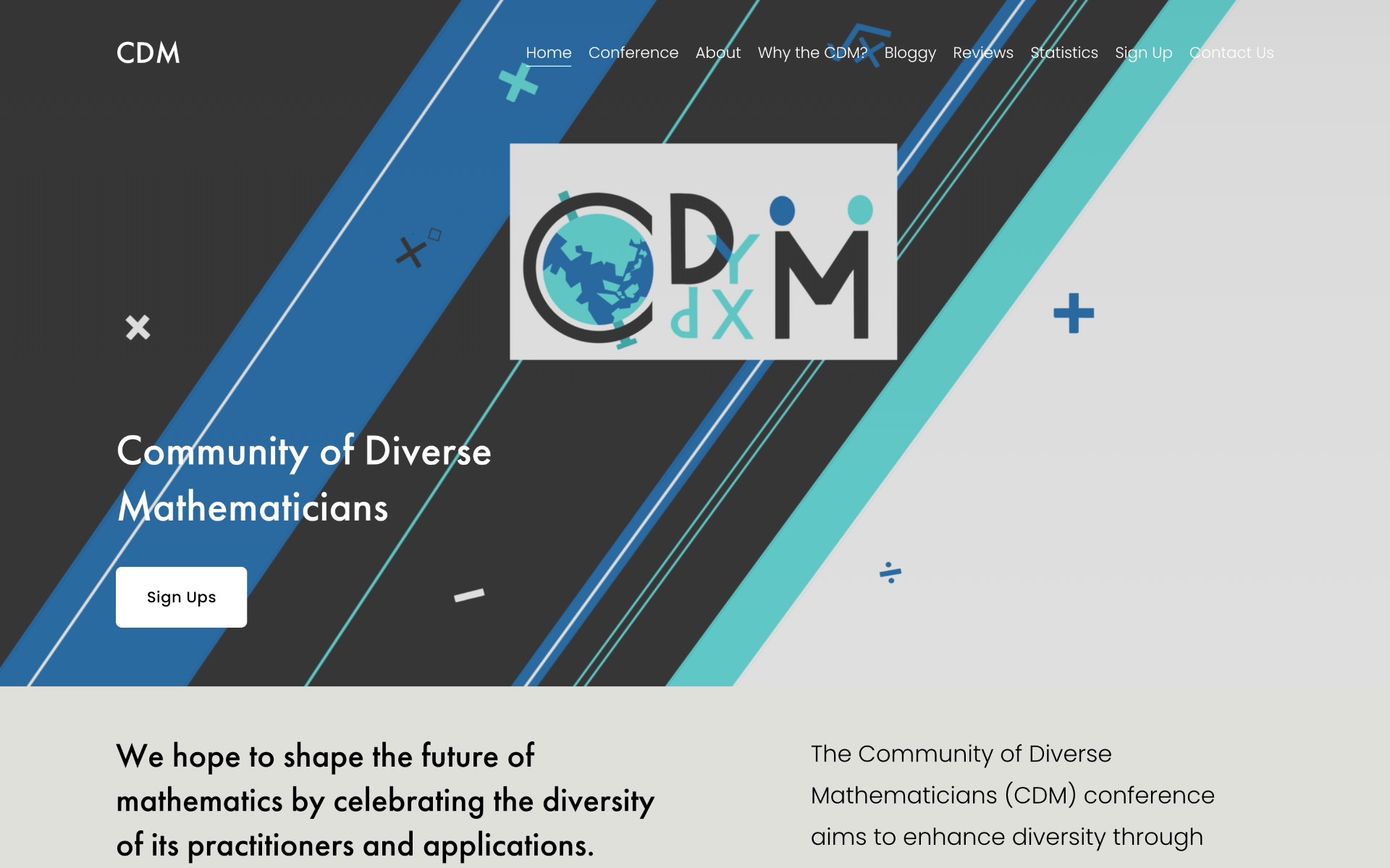
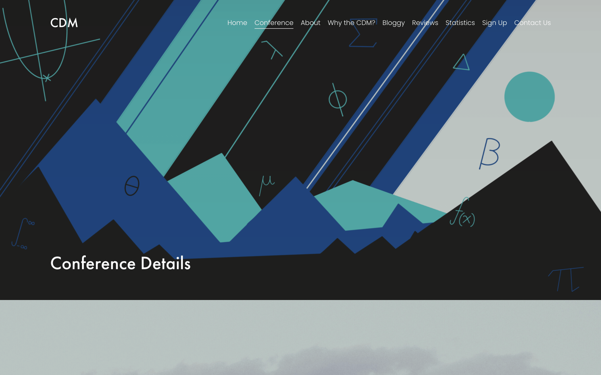
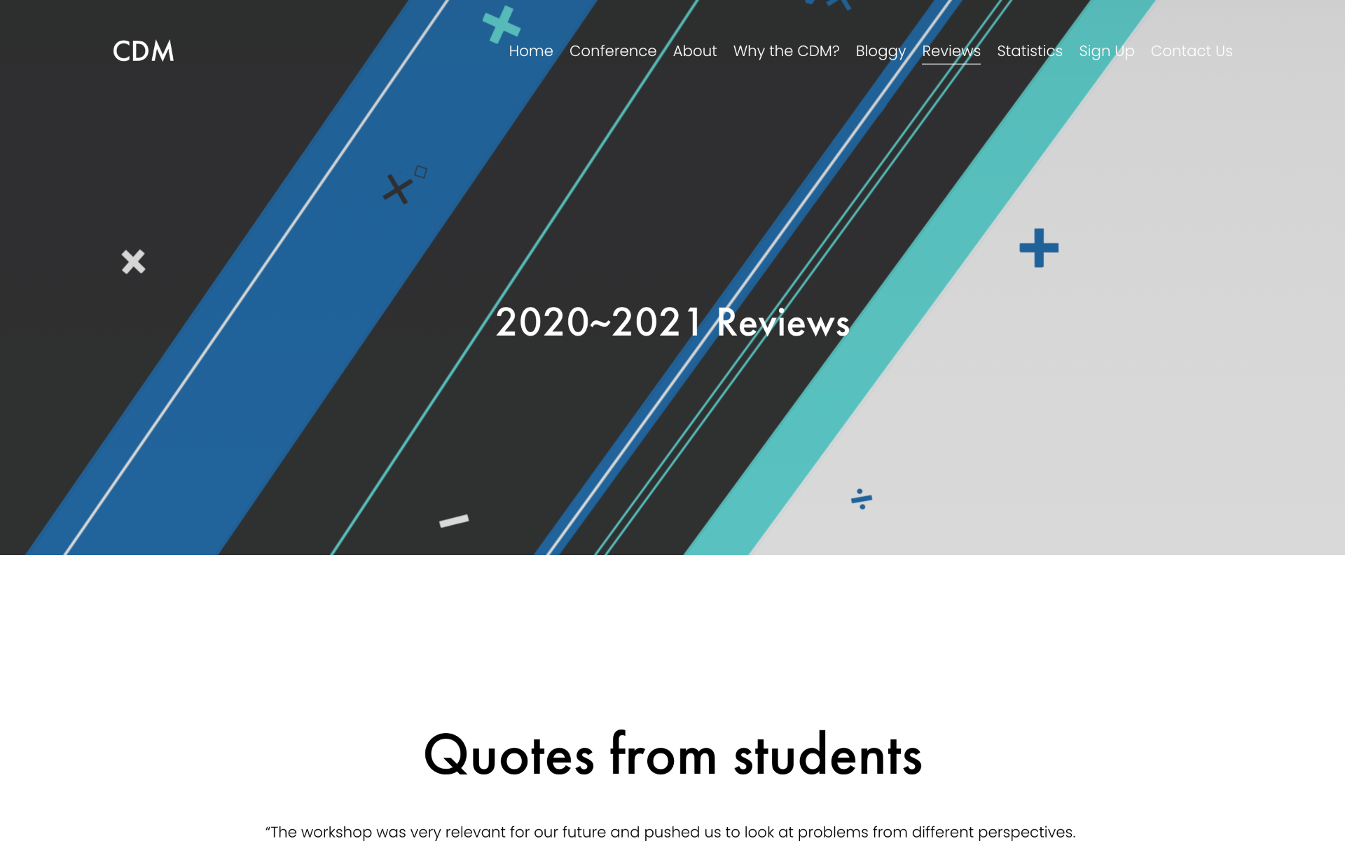
Below are some images of the website. I tried limiting color use to only the ones used in the logo. This is to avoid headache-inducing visits to the website.

*note:
When I mean “UWC really doesn’t value visual arts much, and that includes design” I mean compared to Maths and Natural Sciences as well as music and dance. Music students, dancers, drama students have performances throughout the year (pre-COVID) but Art students never showcase their art. Nobody knows or cares about what Art students are doing.