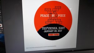
Research – Research was very useful in this process, because almost all of my design was based solely off of the research I had done last time on how to use pages in designing. This allowed me a much greater degree of customisation in my design and I could create what I had truly envisioned. Research was also useful in getting the official colours of the TEDX logos, to make sure that my logo was correct by their usual standards.
Teaching Myself – The most important and complicated thing I learnt today was how to use the HEX and RGB colour systems to find exact colours when getting my pages logos set up. This was very useful for getting my colours correct.
One Thing I learnt from a Peer – Using icon images makes things much easier and allows my design to look much more professional. This will make my design both better and more efficient.
Reflection from Start of Day – My expectations matched that pretty well – I stuck with the plan more or less throughout, going through in order of priority the various client requirements before going through with other self designs.
Peace by Piece – My logo currently doesn’t say much, but I think the fitting pieces on my logo really represents the idea of a solution to a problem one at a time, capturing at least part of the theme of this year’s TEDX UWCSEA.
Peer Design – I think this design really interprets that theme by showing multiple peaces working together to form part of the logo. This captures the whole idea of peace by piece, with many parts forming the whole.

