Screencast:
Category: Uncategorized
Our Client Header: The Final Post
This’ll be structured as question-by-question, so let’s get started.
- You can click here to see the folder with the pictures of my process. I started off with a main theme: nature. I don’t know Advaitha particularly well, but being “energetic and open” was listed as one of her hobbies, so I started with that as my central theme. I added a banner and scrolled through a series of colour choices, going from a starkly contrasting black-green to a more soothing dark green. I added a smaller sub-image to the banner, but quickly deleted it, as I wanted it to be as simple as possible. I scrolled through the backgrounds, until finding a “galaxy” theme I quite liked, as it emphasised my focus on simplicity. I then layered a few more backgrounds, from papyrus to metal, to make the image less stark and more easy on the eyes.
- Here is the final product. Of all the five design principles (balance, repetition, contrast, dominance, and hierarchy), I found that hierarchy worked best, as I managed to make the rest of my image (the background) tan and soothing, making the banner itself “pop” out more, but not as loudly or disrupting as it would’ve been otherwise.
- Here is the post I made on Adam Grant of TED. I thought that in this task I was, unfortunately, a taker, though not as much as humanly possible. In fact, some times, I was even a giver. I helped in the group, of course, but I also often found myself banking on the work other people would do, instead of actively helping them. Definitely something to work on.
- Here is the client specification. Unfortunately, I’m not awfully close to Advaitha. In fact, I don’t know here very well at all. Fortunately, Veronika, who was in our group, knew Advaitha far better than Taran and I, and helped us direct our products to fit her hobbies. While it was tough, I felt that I tried my best to include, even if not explicitly, her hobbies, such as trying to make best use of contrast of the turquoise-green we had agreed upon as a colour.
- I think that I would stick with Picmonkey, as it struck the perfect middle ground between being easy to use, and complex enough to really make something cool with (such as the ability to layer multiple backgrounds).
Drama ATL’s
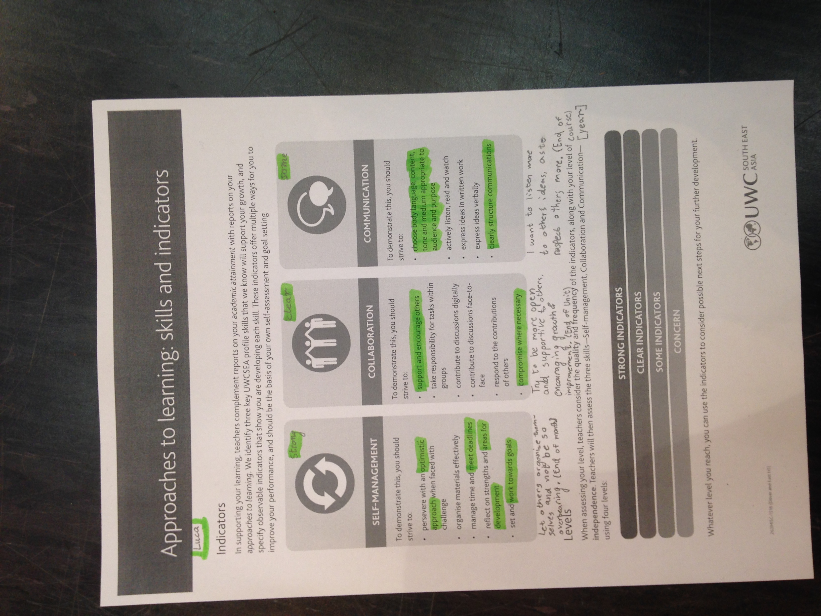
So, as basically everyone who lives within a 10 kilometer radius of the school knows, ATL grades, as well as attainment grades, are coming out next week. Because of this, all teachers are asking us to reflect on some of our Drama ATLs. Fortunately, this is pretty easy for me, as I’m currently working on the piece of work that is my Drama project (the Cat in the Hat), so it’s pretty easy to rate my performance. I’ve set a goal for each learner profile, seen below:
Self-Management: Help others organise themselves, but being careful to not be patronising or overbearing (aiming to be achieved by the end of the month).
Collaboration: Try to be more open and supportive to others, encouraging growth and development (aiming to be achieved by the end of the unit).
Communication: Listen more attentively, as to respect other’s ideas more (aiming to be achieved by the end of the school year).