The Design Basics
Proximity
Proximity is using visual space to show the relationship in your content, this means making sure related items are grouped together. Blocks of text will be together, and visuals will be together, this is to show how the items are related with one another. It will make your work easier to read and understand.
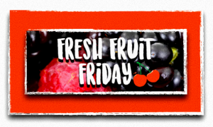
To have a stronger use of proximity in my draft, I could have deleted the cherry as there were already fruits in the background, and the texts were together. The cherry was the only one there, it did not belong with another visual.
White Space
White Space is negative space, the space between your content, between lines and outer margins. The purpose of white space is to help you understand the different sections, giving room for your work to breathe, making sure the work is not too tightly packed.
I think the white space in the sides are okay, the content has enough room to breathe. However, to have a stronger use of white space I could have left more space between the text and the top of the border. The margins at the top are too close, I could either make the box on the inside bigger, or make the text smaller.
Alignment
Alignment is to have each grouping evenly spaced and aligned with equal sized margins. Alignment will make the composition easier to navigate, without this your work will look disorganised.
I did the alignment myself in the logo, so I could have improved on paying more attention to the detail. For the word ‘Friday’ I am not sure if it is aligned well, if the margins are equal. For the other text I could have also looked more carefully as looking at the draft again, the margins don’t look equal. The text seems to be heading towards the left, I need to make sure it is in the middle.
Contrast
Contrast is when item is different from another, contrast helps catch the readers eye, create emphasis or make them pay attention to something important. We can use contrast by changing the colour, size, shape or visual weight of the object, we can also use contrasting styles of text.
In my work I see contrast between the background picture and the red, with the white text. This calls attention to the text, and makes the reader see the text first. This is important as I want the reader to see what the logo is about first, then look at the other visual elements. There is also contrast between the border and the picture of the fruits, making the logo easier to see.
Repetition
Repetition is to have a consistent look and feel, this means reinforcing your design by repeating or echoing certain elements. For example, staying consistent with the colour palette, using the same header style. Staying consistent will make your work easier to read, this is so that viewers will know what to expect which will allow them to focus on the content.
I stayed consistent with the font, using the same font in the logo. Although this is because I did not have much text, I could have made the word ‘Friday’ have a different font. I mainly focused on staying consistent with the colour palette, this logo is mainly white and reds. I used white for both the border and the text, to create a divide between the reds in the logo. I used the same red the Cherry had for the red in the background.
Rough Draft Work
https://lifehacker.com/5864004/the-done-manifesto-lays-out-13-ground-rules-for-getting-to-done
Process of creating a logo:
Touching up with FOTOR:
After reading the article, I realised that I could have experimented more, instead of trying to make it perfect it would have been better to try different things out and make mistakes.
Thinking about my client

I want my logo to communicate the purpose of writers fortnight, to show the passion of the speakers and those who were listening. The empathy map connects to this as when listening to the speakers in writers fortnight, you will feel passion, admiration and inspiration. I want my logo to communicate this idea, showing how impactful writers fortnight is.
I was already familiar with the Illustrator, however from experimenting with different tools I hadn’t tried before I found myself learning new things. I did not know about the type on a path before this, however from looking at the tutorial I could follow how to do it. When dealing with problems, it’s important to think of a different solution and keep trying.
I had empathy by helping someone that was not as familiar with Illustrator. I did not have to persevere with an optimistic mindset in todays class but when I first learnt Illustrator this was something important to keep in mind. It took a while for me to understand the different tools and use them well, so being resilient was an important skill.


