ENGLISH – Shakespeare’s Macbeth

Analyse the ways in which Shakespeare evokes contradictory feelings towards his characters.

The characters in “Macbeth” are quite complex and Shakespeare does this by confusing the audience by invoking contradicting feelings in the audience for the characters. An example of this is the character, Macbeth. In act 2 scene 1, he admits that he’s been having evil thoughts towards Duncan during his conversation with the dagger, making him a bad person because he actually ends up killing Duncan. Then, Macbeth says “I’ll go no more. I am afraid to think what I have done; look on’t again, I dare not” (2. 2. 54). This shows the audience that he is regretful and feels guilty about killing Duncan and doesn’t want to look at the murder scene anymore.

Comment on the significance of dialogue and ensemble scenes in affecting mood and positioning the audience.

In my opinion, I think that when Shakespeare includes ensemble scenes, it’s so that when there’s an important event a range of perspectives are shown, giving the audience a better understanding of the vibe at the time of the event. In ensemble scenes, I don’t really think in real life you would say as much as what the characters in “Macbeth” say because you might keep some things to yourself, but the dialogue tells the audience exactly what the characters are thinking, and sometimes it may even provoke more thinking within the audience. An example of this is just after Macbeth killed Duncan and Macduff arrives at the castle to wake up Duncan. Lennox was also there and since the audience knows that Duncan was killed but Lennox doesn’t, there is a bit of irony because Lennox says that “the night has been unruly: where we lay, our chimneys were blown down … some say, the earth was feverous and did shake” and then Macbeth replies with “’Twas a rough night” because it certainly was (3.46). Then Macbeth says that “had [he] but died an hour before this chance, [he] had lived a blessed time, for from this instant, there’s nothing serious in mortality” (85). After everyone but Malcolm and Donaldbain leaves the stage, the two of them talk and says that they must flee because they have a target on their backs since their father was killed.

This scene shows that after Duncan dies, the emotions people are feeling are varied. From ‘sorrow’ felt by Macbeth to self-preservation/worry by Malcolm and Donaldbain.
ENGLISH – Shakespeare’s “Macbeth”

Differentiate between the direct and indirect characterization Shakespeare uses in order to construct his characters.

Shakespeare uses a variety of ways to introduce us to the characters of “Macbeth”. One of these ways is through direct characterization which is when a character explicitly says something about a quality of another character. An example of this is when Captain says “For brave Macbeth – well he deserves that name – disdaining fortune…” (1. 2. 16). From this, we can tell that Macbeth is a brave person, or a least seen as a brave person by others because it is directly said by Captain.

Another way Shakespeare constructs his characters is through indirect characterization which is when the character does or says something that doesn’t directly mention the quality or trait, but can be understood from the character’s behavior. For example, when Lady Macbeth says “Had [Duncan] not resembled my father as he slept, I had done’t”, as a class we agreed that Lady Macbeth wasn’t a good person and quite evil, but from this line we can understand that she has a little humanity inside of her and isn’t a completely terrible person.

Personally, I feel like Shakespeare uses a good balance of direct and indirect characterisation because if there was too much direct characterisation in “Macbeth”, it wouldn’t be as interesting and complex as it is, and if there was too much indirect characterisation, it would be too complicated because everything would have double meaning and people studying “Macbeth” would never have a break. One of my favorite quotes is an example of an indirect characterization when Lady Macbeth reads the letter that Macbeth sent her which reads “This have I thought good to deliver thee, my dearest partner of greatness…” (1. 5. 9). This shows that even though they were living in a patriarchal society, Macbeth saw Lady Macbeth as an equal which was really nice and 2018 of him.

DPERS – Using The Divi Builder

THE DESIGN BASICS

Proximity:
Proximity is all about using visual space to show relationships in your content. All you have to do is make sure related items are grouped together; for example, in blocks of text or elements in a graphic. Groups that are not related to each other should be separated, to visually emphasize their lack of a relationship. This makes your work easier to understand at a glance – whether it’s purely text or something more visual.

White Space:
White space is an important part of every composition. This doesn’t mean literal “white space” – it just means negative space, like the spaces between your content, between lines, and even the outer margins. White space helps you define and separate different sections; it gives your content room to breathe.

Alignment:
Alignment is something you deal with all the time, even if you don’t realize it. Whenever you type an email or create a document, the text is aligned automatically. The most important thing is to be consistent. Each grouping is centered with an imaginary line and is also evenly spaced out and aligned, with equal-sized margins. It’s that attention to detail that makes the composition easier to navigate.

Contrast:
Contrast simply means that one item is different from another. In layout and composition, contrast helps you do many things; for example, catch the reader’s eye, create emphasis, or call attention to something important. Some strategies used to create contrast are: using different colors, adjusting the size, shape, or visual weight of an object, or use contrasting font styles. Contrast is also closely tied to hierarchy, a visual technique that can help the viewer navigate your work. Make high-level or important items stand out by making them larger, bolder, or more eye-catching in some way.

Repetition:
Repetition is a reminder that every project should have a consistent look and feel. That means finding ways to reinforce your design by repeating or echoing certain elements. For instance, if you have a specific color palette, look for ways to carry it through. If you’ve chosen a special header style, use it every time.

ROUGH DRAFT WORK
THINKING ABOUT MY CLIENT
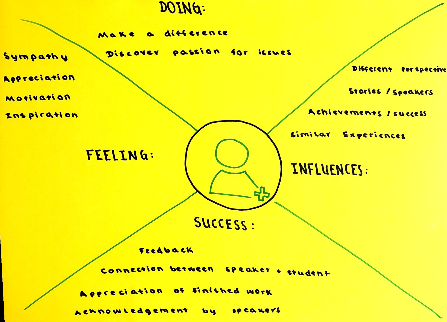
I think our Writers’ Fortnight logo should communicate how each speaker has a different story, where they came from and the things they achieved. I also think our logo should stir emotions such as sympathy and appreciation in the viewer, that way they can already establish a small connection to the speaker and that might lead to them becoming more interested in Writers’ Fortnight.
<iframe src="https://docs.google.com/presentation/d/e/2PACX-1vQeRBtiyLspHI94efy6ZuRHgXnJUrf-vl3xuOgsK9E6NfWi1f9ohY0LODtbhvgDA-cV7LEno5ilt0HS/embed?start=false&loop=false&delayms=3000" frameborder="0" width="960" height="569" allowfullscreen="true" mozallowfullscreen="true" webkitallowfullscreen="true"></iframe>

Link to slides: https://docs.google.com/presentation/d/1YSBCDuAXJ8TQmvjmhEOPjFHPwDhgLvzW7SiwsPfeQbM/edit?usp=sharing

Which of the ‘must have skills for 2020’ did you exercise the MOST today and where in your slides can we see evidence of that?

I think I used creativity the most during this session because I adapted the original design my group had come up with, and then made several different versions using the same font. You can see this throughout my slides, especially on the tenth slide where all the logos I came up with are.

If Self-management asks us to push through frustrations with a positive mindset, where in this logo design process do you feel you were able to practice doing just that? How is that skill useful outside of the classroom?

Personally, I feel like I was a self-manager throughout the whole process, but especially near the end when we actually made the logo. When we started to go on illustrator and use the fonts and colours that we decided on, I started to doubt the original idea that my group and I had come up with because I felt like the colours didn’t go well together, there were tons of better fonts we could use, and I honestly didn’t really feel like it portrayed and advertised writers’ fortnight for what it is. As I continued, I started to change the logo and experiment with different ideas that I thought related to writers’ fortnight and I felt a bit happier with my logo. Being a self-manager is useful in all situations, whether it’s in a class or just life in general. If you’re able to have a positive mindset for everything that you do, the things you’ll produce will be great and you’ll influence the people around you, who will also start thinking with a positive mindset.

When you set a goal to communicate a message about Writers’ Fortnight in your logo, how well do you feel your final work achieves that goal? What makes you think so?

I feel like my logo does an okay job of communicating the purpose of writers’ fortnight. This is because it does mention writers’ fortnight in the logo, and the pencils represent the writing element, but when I attempted to portray that writers’ fortnight was a program which aims to share stories and spread passion about a variety of topics, it looked a bit cheesy and too much like a valentines day card.

Do you find communicating through a design like your logo a more straightforward process than writing an essay, or a more complicated process? Explain your answer.

Using a design to communicate ideas isn’t more straightforward than writing an essay, but it’s not more complicated either. I think this because you have to consider a lot of things when coming up with your design, and you also have to remember that it can open to interpretation, so whether its intentional or not, the person may understand a completely different idea than what you intended to come across. In a way, it’s also less complicated because some people find it easier to work with visuals rather than communicating things verbally or through writing.